How are CO₂ concentrations related to warming?
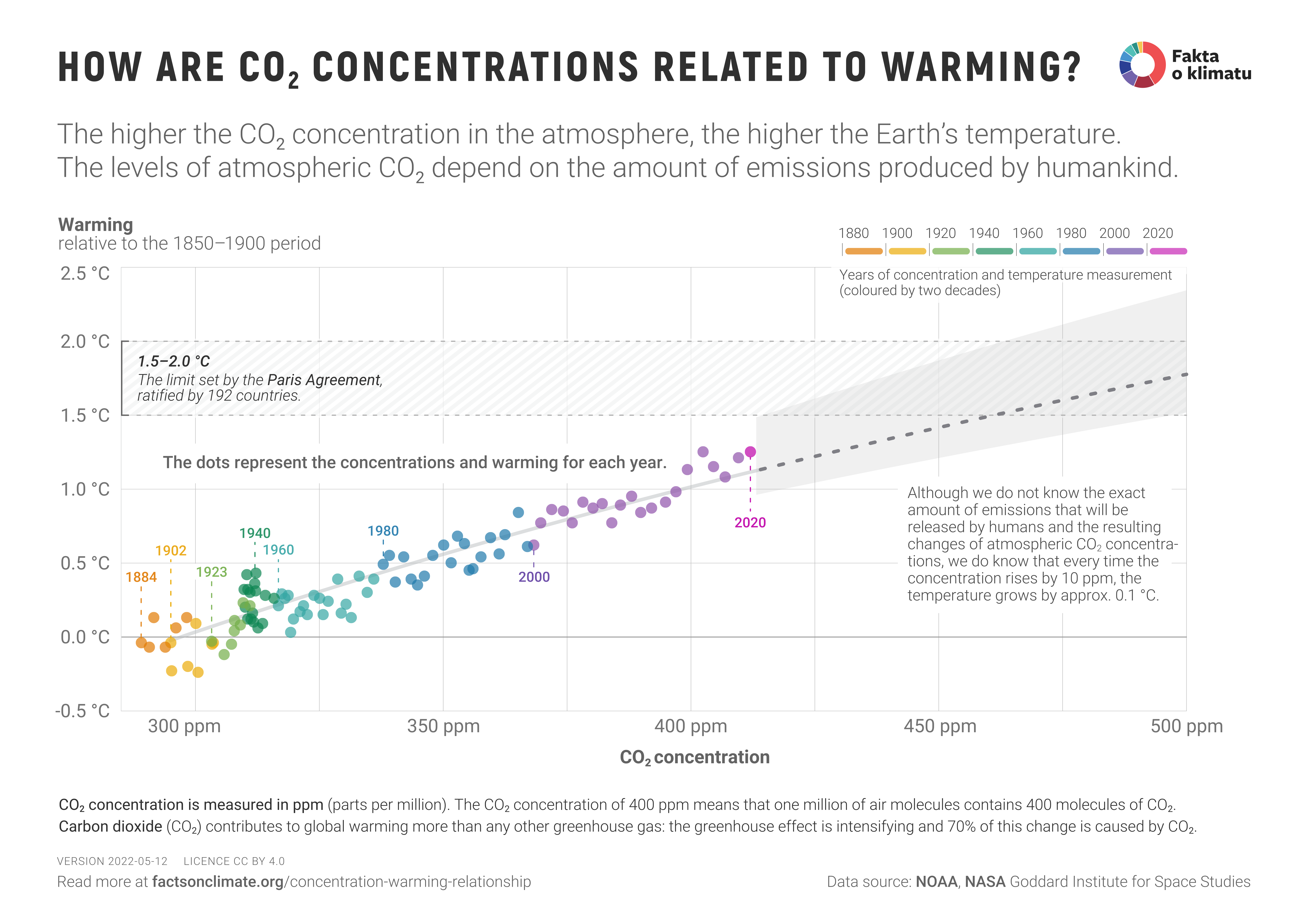
Historical data as well as future climate models show that global warming is (approximately) directly proportional to the increase of CO2 concentrations in the atmosphere. More specifically: every time the CO2 concentrations rise by 10 ppm (parts per million), the mean global temperature increases by 0.1 °C.
Table of Contents
What the graph shows
The points on the left side of the graph show the individual years from 1884-2020. The location of the point corresponds to the CO2 concentration values (on the horizontal axis) and the temperature anomaly values for that year (on the vertical axis). The graph shows that the relationship is approximately proportional, with each 10 ppm increase in CO2 concentration leading to a temperature increase of about 0.1 °C. The text below describes this relationship in more detail.
The dots in the graph are color-coded per individual year (grouped by 20 years each). The points show that the increase in CO2 concentrations has been accelerating in recent years, corresponding to increasing annual CO2 emissions.
On the right-hand side of the graph, we show the expected global warming for higher CO2 concentrations if emissions continue at the current rate.
How is the relationship between CO2 concentration and global warming inaccurate?
The dominant effect of carbon dioxide on global warming is well established, so the graph shows causation, not just random correlation. On the other hand, many other factors also influence global warming: other greenhouse gases, currents in the atmosphere and ocean that distribute heat around the planet, as well as aerosols and cloud formation (the shading effect). Is it correct to state that every time the CO2 concentration rises by 10 ppm also leads to a rise in temperature of about 0.1 °C? The following paragraphs show how this relationship is only an approximation.
-
The theoretically derived relationship for the dependence of global warming on greenhouse gas concentration is logarithmic. 1 2 However, for a small range of concentrations, we can approximate this relationship reasonably well with a linear relationship, as shown by the measured data.
In this relationship, denotes the initial concentration, is the increase in concentration, and is a parameter called climate sensitivity - it expresses how much the temperature of the planet increases when the concentration of greenhouse gas in the atmosphere doubles. The direct proportionality between concentrations and global warming ceases to be a good approximation if the increase in concentrations is too large.
-
The climate system has inertia - some processes reach equilibrium in units of years, others in tens or hundreds of years. Therefore, it is necessary to distinguish between short-term climate sensitivity (TCR, Transient Climate Response), which takes into account processes on the order of units of years, balanced climate sensitivity (ECS, Equilibrium Climate Sensitivity), which takes into account processes on the order of tens of years, and long-term climate response (ESS, Earth System Sensitivity), which takes into account processes on the order of hundreds and thousands of years.3 4 5 Current climate system models suggest short-term climate sensitivity values TCR of around 1.7 °C (range 1.3-3.0°C)6 and balanced climate sensitivity values ECS of around 3 °C (range 2.3-4.7 °C).7 8 The data we show in the graph are continuous and correspond to the short-term climate response. If concentrations were to stabilise, temperatures would continue to rise for several decades before global warming stopped at values corresponding to the balanced climate sensitivity. In other words, the direct proportionality between concentrations and global warming would cease to hold if CO2 emissions were radically reduced to near zero. In that case, concentrations would stabilise or begin to fall, but the planet’s temperature would continue to rise for some time.
-
Carbon dioxide is responsible for about 70% of global warming.9 The remaining 30% is due to other greenhouse gases, mainly methane and nitrous oxide, which are also increasing in the atmosphere. Along with greenhouse gases, however, mankind also emits aerosols, which have a cooling effect on the planet by reflecting solar radiation and contributing to the formation of clouds.10 The global warming shown includes all these phenomena, but only CO2 concentrations are plotted on the horizontal axis. Thus, the claim of direct proportionality between concentration increases and warming is misleading in that it only shows a dependence on the dominant factor. However, because the cooling effect of aerosols and the warming effect of other greenhouse gases partially cancel each other out, it can be argued that CO2 is the driving factor behind well over 70% of global warming.
Where does the data in this infographic come from?
-
Temperature anomaly values for each year are from the NASA Goddard Institute for Space Studies dataset.
-
CO2 concentration values for each year are based on measurements from the Scripps Institution of Oceanography, which is part of NOAA.
-
The trend curve corresponds to the equation , where is the concentration, is the initial concentration, and is the continuous climate sensitivity parameter. This theoretical relationship is used in idealized conditions of simulations – either as a relation for warming after equilibrium, where S corresponds to ECS (Equilibrium Climate Sensitivity), or for the transient warming when the CO2 concentration increases by 1% each year, where S corresponds to TCR (Transient Climate Response). However, in the data shown, global warming is not only due to an increase in CO2 concentrations but also due to increasing concentrations of other greenhouse gases. Therefore, we take the TCR and ECS values obtained from the simulations as indicative only and fit the value of S to show the dependence (S = 2.37 °C). The uncertainty band is shown between S = 2.0 °C and S = 3.1 °C, which corresponds to the uncertainty profile in both TCR and ECS and partially accounts for the effect of climate inertia in stabilizing CO2 concentrations.
Historical note
The link between global warming and atmospheric carbon dioxide concentration is one of the most crucial and longest-studied relationships in the study of climate change. The first calculations were published by Svante Arrhenius in 1886, and his estimates of climate sensitivity have been confirmed and refined by subsequent studies.
Sources and notes
-
More precisely: radiative forcing is directly proportional to the logarithm of concentration - and warming is directly proportional to radiative forcing; for more see wikipedia: Radiative Forcing ↩︎
-
Skeptical Science: How could global warming accelerate if CO₂ is ‘logarithmic’? ↩︎
-
Knutti R. Hegerl. “Beyond Equilibrium Climate Sensitivity.”, Nature Geoscience 10.10, str. 727–736 (2017). ↩︎
-
Carbon Brief explainer: How scientists estimate climate sensitivity ↩︎
-
A more detailed discussion of the concept of climate sensitivity, including different time scales wikipedia: Measures of Climate Sensitivity ↩︎
-
G. A. Meehl et. al. “Context for interpreting equilibrium climate sensitivity and transient climate response from the CMIP6 Earth system models.”, Science Advances 6.26 (2020). ↩︎
-
Carbon Brief guest post: Why low-end climate sensitivity can now be ruled out ↩︎
-
S. C. Sherwood, Webb, et. al. “An Assessment of Earth’s Climate Sensitivity Using Multiple Lines of Evidence.”, Reviews of Geophysics 58.4 (2020). ↩︎
-
Myhre, G., Myhre, C. E. L., Samset, B. H. & Storelvmo, T. (2013) “Aerosols and Their Relation to Global Climate and Climate Sensitivity.”, Nature Education Knowledge 4.5, str. 7 (2013). ↩︎

")